

How to live in a painting
How to live in a painting
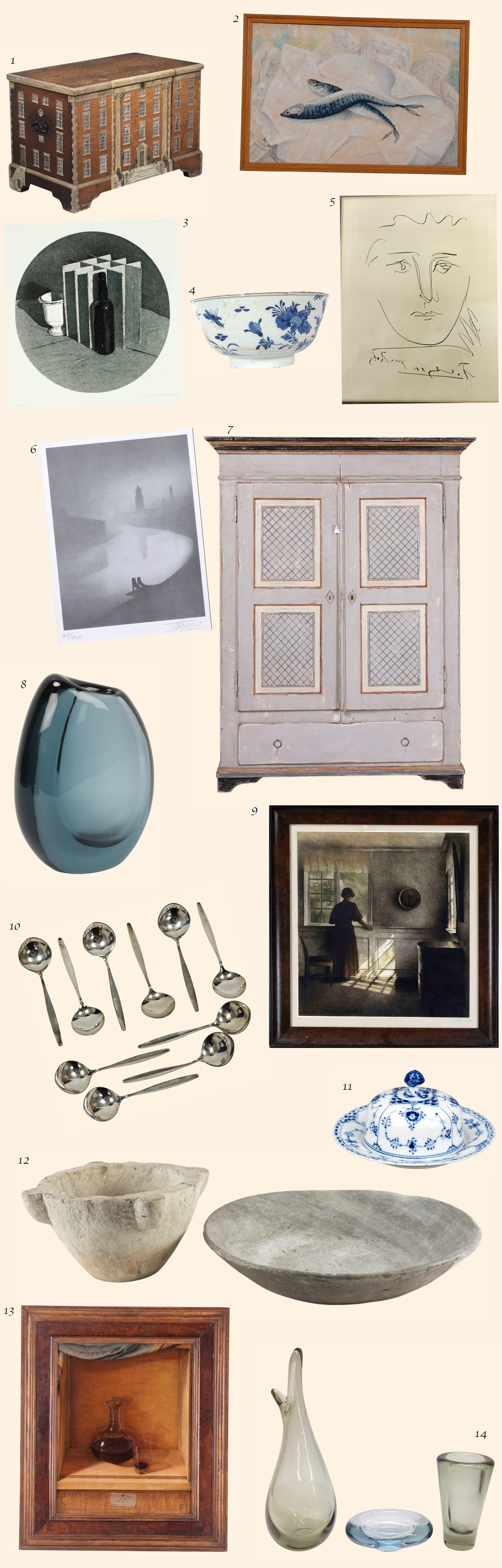
A pictorial guide to creating your very own Hammershøi-esque interior with live auction listings


Thawing. As the world gently thaws, my mind wanders to Vilhelm Hammershøi. This time of year, when the harshness of winter begins to melt away and greys and heavy blues still linger. It’s also a gentle time when the light changes, introducing warmer yellows, and occasionally, our homes are flooded with light again.
It’s been a bruising time; the past winter has left its mark. Yet, I find the muted colours soothing as the slightly warmer tones gently nudge us forwards.
Hammershøi’s interiors capture the essence of thawing beautifully. They seem to seize these fleeting moments of thin sheets of ice on puddles with the spring sun’s rays gliding across the surface. It’s a very subtle moment, hard to capture or even notice at times.


My first meaningful encounter with Hammershøi’s work was on a film set in Copenhagen, during this very transition from winter to spring. The set, deeply inspired by Hammershøi's interiors, reflected their cinematic quality. I was hoping to share these glimpses into Hammershøi influence through some photographs I took on set. Unfortunately, they are still locked away in storage. In a few months, when things hopefully settle, I’ll share more incredible interiors I was fortunate to work in.
Hammershøi’s most famous works are his paintings of interiors, particularly those painted in the flats he shared with his wife, Ida, in Copenhagen. After their marriage in 1891, Ida became not just a central figure in his life but also in his work, often featuring as the focal presence in his introspective pieces. The selection of their apartments in Copenhagen was intentional; each home was essential to his art, becoming silent yet dominant narratives of his paintings. Rooms with sparse furnishings or left empty, without or without any figures, varied in simple and subtle compositions.

This signature aesthetic of sublime simplicity and the uniformity of muted tones set Hammershøi’s work apart from the contemporary Danish art scene. In his paintings, he reverses the traditional lesser importance of the interior, which often serves as a background to figures, and instead allows the empty space to dominate the picture. When figures do appear, they seem almost incidental, blending into the setting in such a way that it’s difficult to tell what they are doing. The narrative is not driven by these figures but by the space itself.
In a 1909 interview, Hammershøi unusually offered some insights into the very spaces he lived in and also used as subjects for his paintings:
‘I like old things. Old homes. Old furniture. I like the unique feel there is to such things.’
And here’s a lesson - while Scandinavian interiors typically embrace a palette of white, modern designs and plenty of light wood, Hammershøi’s interiors introduce a distinct twist. Amidst the soft tones, you'll find heavier, darker wooden pieces, often Biedermeier and sometimes Louis XV, in mahogany or cherry wood. These styles are often relegated to more traditional settings and might appear unpopular in contemporary designs. Somehow, Hammershøi puts a blue and white porcelain vase on top of such pieces and it becomes art. His interiors are a lesson in how to work with these heavier, darker wooden pieces of furniture in an otherwise minimal interior.
Above, I have paired the two paintings with items currently available at auctions for an easy breakdown of his style.
Below, I’ve included additional pieces that either could have been in one of Hammershøi’s Copenhagen flats or items that embody the muted tones and textures characteristic of his work.
His calming, mindful interiors show us that sometimes it’s all just about light, simplicity and strategic accentuation.
Ax
You can all respond to this email from your inbox and share your thoughts. Your message will reach me directly. I’d like to turn this format - how to live in a painting - into a series. What do you think?